 Skip to content
Mobile Responsive Shopify Design: The Ultimate 2026 Guide for UK Retailers
-
3222 words · 16 min read
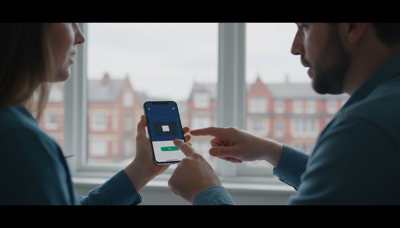
Did you know that over 72% of UK retail traffic now comes from mobile devices, yet nearly 40% of users will abandon a site if it takes more than three seconds to load? Getting your mobile responsive shopify design right isn't just a technical task; it's a vital part of your sales strategy. It's a common frustration to see images looking cropped on iPhones or customers dropping off because the checkout feels like an endless marathon. We understand how daunting these technical hurdles can feel when you're trying to scale your business.
You probably agree that a desktop-first approach no longer cuts it in a market where shoppers expect instant results. This guide will help you master the art of mobile-first commerce to ensure your store is fast, seamless, and built for growth in 2026. We'll show you exactly how to improve your Core Web Vitals to help your Google rankings and fix those blurry mobile images to keep your conversion rates high.
We'll walk through the expert strategies we use as Shopify Partners to help retailers streamline their mobile experience and boost sales. If you're ready to future-proof your store, you can get in touch with our team today for a rock-solid plan.
Key Takeaways
- Understand why mobile traffic now accounts for over 70% of UK retail and how to adapt your store architecture for a mobile-first 2026 landscape.
- Master the five essential pillars of mobile responsive shopify design to ensure your navigation, imagery, and speed are perfectly optimised for handheld users.
- Discover the performance advantages of Custom Liquid development over "out of the box" themes and why bespoke technical execution is vital for scaling.
- Learn how to eliminate checkout friction and boost conversions by implementing "One-Tap" payment solutions like Apple Pay, Google Pay, and Shop Pay.
- Identify how to future-proof your brand by partnering with a UK-based Shopify expert to combine local support with global eCommerce standards.
Why Mobile Responsive Shopify Design is Non-Negotiable in 2026
What defines a high-performing mobile responsive shopify design today? It is no longer just about resizing images; it is a fluid architecture that prioritises the handheld user experience above all else. As a Shopify Expert UK, we've watched this technology evolve from a secondary feature into the primary driver of retail success. This approach relies on the core principles of responsive web design, where every element of your store dynamically adjusts to provide a seamless journey on any device.
The data from early 2026 is clear: mobile traffic now accounts for over 70% of all UK retail visits. For a business based in Darlington or Newcastle, ignoring this shift is a significant risk. Google's Mobile-First Indexing means the search engine primarily evaluates the mobile version of your site to determine your rankings. If your mobile experience is clunky, your local visibility will decline, regardless of how good your desktop site looks.
Speed is the silent architect of your conversion rate. A one-second delay in mobile page load time can slash conversions by up to 20%. Friction, whether it's a slow-loading image or a button that's too small to tap, creates an immediate barrier to purchase. Eliminating these hurdles is the fastest way to scale your revenue and build a future-proof brand.
The Evolution of Thumb-Driven Commerce
Modern shoppers interact with their devices using a single hand, making the "thumb zone" the most critical area of your layout. By 2026, screen sizes have continued to expand, pushing essential navigation and "Add to Cart" buttons toward the bottom of the screen where they're easiest to reach. We now integrate haptic feedback into many Shopify builds; these subtle vibrations provide tactile confirmation when a user interacts with a menu, mirroring the physical reassurance of a brick-and-mortar shop. If you're ready to improve your store's usability, you can get in touch with our team for a design audit.
Mobile Performance as a Ranking Factor
It's a common mistake to assume that a "responsive" theme is an "optimised" one. While a theme might fit the screen, it may still fail Google's Core Web Vitals if it's bloated with heavy scripts. Largest Contentful Paint (LCP) is a specific metric that measures how quickly the main content of your page becomes visible to a mobile user. A slow LCP often triggers a high bounce rate, as 53% of mobile users will abandon a site that takes longer than three seconds to load. To stay competitive, your Shopify store must balance aesthetic appeal with rock-solid technical performance.
- Visual Stability: Ensuring elements don't jump around as the page loads.
- Interactivity: How quickly the store responds to a user's first tap.
- Asset Optimisation: Serving correctly scaled images to reduce data usage.
The 5 Pillars of High-Conversion Mobile Shopify Stores
Mastering mobile responsive shopify design isn't just about shrinking a desktop layout. It's about building a tailored experience that respects the user's time and thumb-reach. High-conversion stores focus on five core pillars: Navigation, Imagery, Typography, Speed, and Checkout. When these elements work together, they form a rock-solid interface that eliminates friction and builds immediate trust with your visitors.
A seamless mobile interface has a profound psychological impact. It signals to the customer that your brand is modern, reliable, and professional. Statistics show that mobile commerce sales are expected to account for 62% of all retail sales by 2027. To capture this growth, your store must maintain consistent branding across every device. This level of detail is a hallmark of any successful Shopify Expert UK strategy, ensuring that a customer's journey feels familiar whether they're on a smartphone or a laptop.
Streamlined Navigation and Menus
The traditional "Hamburger Menu" is due for a 2026 upgrade. Modern users expect "thumb-zone" navigation, where critical links are placed at the bottom of the screen for easier reach. Implementing predictive search is another game-changer; it helps mobile shoppers find products without typing long strings of text on a small keyboard. For retailers who sell both online and in person, unifying your retail and online store experience with a Shopify POS integration ensures your navigation categories stay consistent across all sales channels.
Responsive Imagery and Video Standards
Shopify makes scaling images simple with its built-in srcset attribute, which automatically serves the best image size for the user's screen. For maximum impact, we recommend using 1:1 or 4:5 aspect ratios. These square and vertical formats occupy more screen real estate than landscape images, making your products stand out. Mobile-first video loops are also trending, but they must be optimised to under 2MB to prevent site slowdowns. Using consistent business graphic design ensures these visuals look professional on high-resolution Retina displays.
Mobile-Optimised Typography and Readability
Readability is the foundation of a good mobile experience. In 2026, 16px is the absolute baseline for body text to prevent users from needing to zoom in. We also focus on generous line-heights and letter-spacing to avoid the "wall of text" syndrome that causes shoppers to bounce. Colour contrast is equally vital; your text must be legible even when customers are browsing your site outdoors in bright UK sunlight. If you're looking to refine these elements for your brand, you can get in touch for a tailored design audit.
Technical Execution: Custom Liquid vs. Responsive Themes
Choosing between a standard Shopify theme and a bespoke Liquid build is a pivotal decision for your brand's growth. While modern themes from the Shopify Theme Store are built with basic responsiveness, they often carry "bloat" to cater to every possible user. This can lead to sluggish load times on 4G or 5G connections across the UK. A Shopify expert UK can strip away this excess, using custom Liquid code to ensure your mobile responsive shopify design is lean and conversion-focussed.
Research from Google indicates that 53% of mobile users abandon sites that take longer than three seconds to load. App bloat is a major culprit here. Every app you install adds external scripts that can clash and slow down the rendering process. Clean, hand-coded solutions provide a rock-solid foundation for site scalability as your inventory grows. By minimising reliance on third-party apps for basic design features, you protect your site's speed and security. If you're struggling with a slow mobile site, it's time to get in touch with our team to audit your code.
Media Queries and Flexbox Strategy
Achieving a professional finish requires more than just fluid grids. We use custom media queries to target specific device widths, ensuring your site looks as sharp on a Samsung Galaxy as it does on an iPhone 15 Pro. This technical precision is central to a mobile-first design strategy that prioritises the handheld user. Flexbox allows us to reorder content blocks dynamically; for example, we can move product descriptions below the "Add to Cart" button on mobile to keep the primary action visible. CSS Grid further enables us to create modern, asymmetrical layouts that don't break when the screen shrinks.
Leveraging Shopify Sections and Blocks
Shopify's Online Store 2.0 architecture allows for sophisticated "hide/show" logic within the editor. You can create mobile-only banners that deliver punchy, vertical-friendly visuals without hurting your desktop SEO or page weight. This ensures your mobile customers aren't forced to download heavy desktop assets they'll never see. This method keeps the mobile responsive shopify design agile and efficient. You can see these strategies in action across our portfolio of Shopify experts, where we've helped retailers streamline their mobile experience since 2006. Testing these custom blocks across different viewports ensures a seamless journey from homepage to checkout.
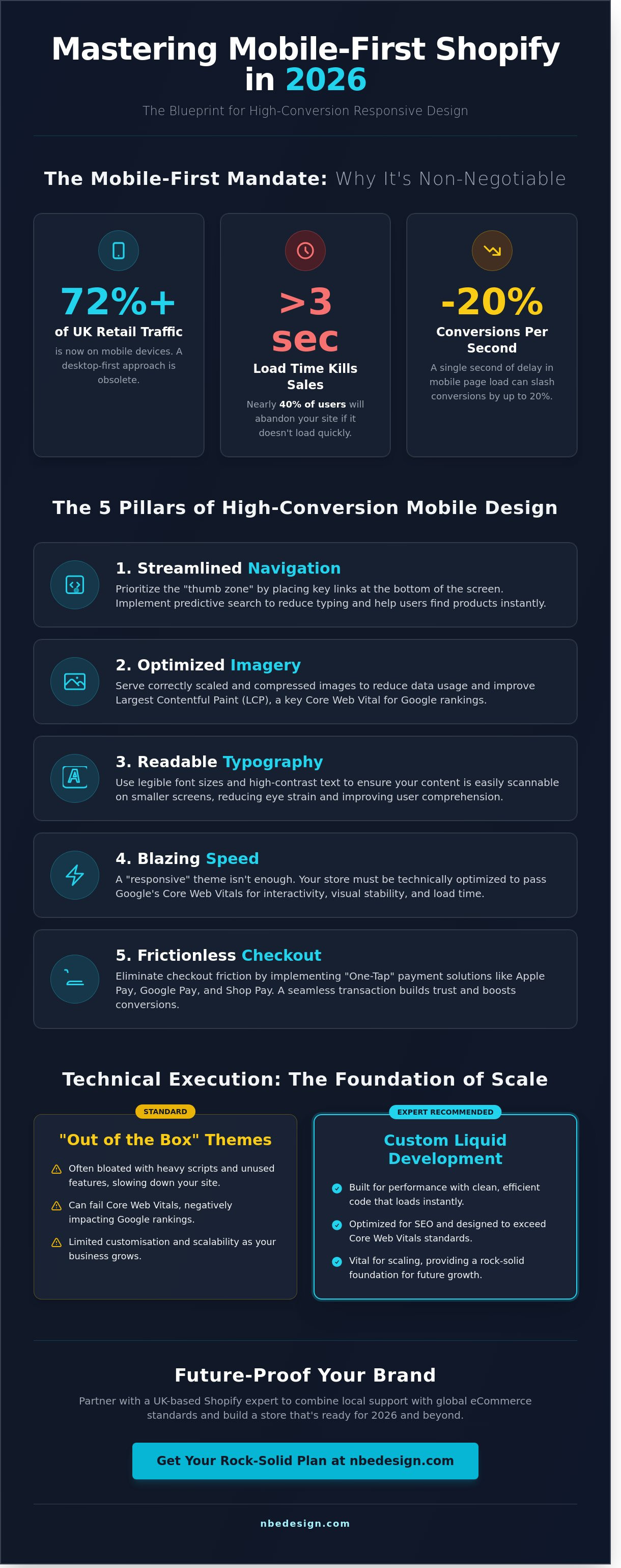
Maximising Mobile Conversions: From Browse to Buy
Mobile shoppers often abandon their carts because the checkout process feels like a chore. Typing long address details or hunting for a credit card on a small screen is a significant friction point. Effective mobile responsive shopify design solves this by prioritising speed and reducing the cognitive load on the user. Our goal is to make the transition from browsing a product to owning it as seamless as possible.
One-tap payments such as Apple Pay, Google Pay, and Shop Pay are essential tools for modern retailers. Shopify's own data indicates that Shop Pay can increase checkout-to-order rates by up to 50% compared to traditional guest checkouts. This is because it stores user data securely, allowing a purchase to be completed in seconds. While desktop conversion rate optimisation might focus on expansive layouts and detailed sidebars, mobile CRO is about removing every possible obstacle. Sticky "Add to Cart" buttons are a great example of this; they keep the primary goal in sight regardless of how far the user scrolls down a product page.
The Mobile-First Checkout Experience
Every extra field in your checkout form increases the risk of a bounce. Baymard Institute research suggests that the average checkout contains nearly 12 form fields, yet the most successful stores trim this down to 7 or 8. Implementing address auto-complete is a quick win that saves users from typing their full street name and postcode manually. You should also ensure that guest checkout is the default option. In the UK market, 37% of shoppers will abandon a purchase if they're forced to create an account before buying. Keeping the process open and frictionless is the key to capturing those "on-the-go" sales.
Trust Signals and Social Proof on Small Screens
Screen real estate is at a premium on a smartphone. You can't afford to clutter the view with dozens of trust badges. Instead, focus on the most impactful signals for a UK audience, such as "Free UK Delivery" or "Easy Returns". These should be placed strategically near the checkout button where they provide the most reassurance. Customer reviews also need to be optimised for vertical scrolling; a simple star rating and a "read more" toggle work better than long blocks of text. Small pieces of micro-copy, like "Secure UK Payment Gateway", placed right at the point of transaction, help to settle any last-minute nerves. As a Shopify Expert UK, we've seen how these small tweaks can lead to a 15% increase in mobile revenue for our clients.
If you're ready to turn your mobile traffic into consistent sales, we can help you refine your store's performance. Get in touch with our team today to start your journey.
Future-Proofing Your Store with NB eCommerce & Design
NB eCommerce & Design stands as the North East’s premier Shopify partner, offering a level of expertise that's difficult to match. We’ve literally grown up with the platform since its birth in 2006, giving us a historical perspective that informs every project we touch. Our "Local Expert, Global Reach" philosophy helps UK retailers bridge the gap between their Teesside roots and an international customer base. We focus on creating a mobile responsive shopify design that doesn't just look good but actually drives growth and simplifies your daily operations.
Unifying Online and In-Store Branding
Your mobile presence should be a digital twin of your physical shop. If a customer visits your Darlington storefront after browsing on their phone, they should recognise your brand instantly. We use professional business graphic design to ensure your visual identity remains consistent across all devices. This unified approach extends to your operations too. By implementing the best till POS system for small shops UK, we help you sync your smartphone storefront with your in-store hardware. It means your inventory stays accurate and your branding stays rock-solid whether a sale happens on a 6-inch screen or at your physical counter.
Start Your Mobile Transformation Today
Improving your store's performance starts with a clear plan. We begin every project with a rigorous mobile-first Shopify audit to identify exactly where you're losing customers. Whether you need a complete migration or a conversion-focussed redesign, we handle the technical heavy lifting without causing downtime for your business. Our team has refined the art of mobile responsive shopify design over nearly two decades, ensuring your store is ready for whatever the future of eCommerce brings.
Don't let a clunky mobile experience hold your business back. Since 2006, we've helped retailers across the UK and beyond scale their sales through smart, efficient design choices. Our process is designed to be supportive and reassuring, taking the stress out of technical transitions.
- Comprehensive mobile-first audits to identify conversion blockers
- Hassle-free migrations from other platforms with zero downtime
- Seamless integration with Shopify POS hardware for a unified retail experience
Ready to scale your business with a partner who understands the Shopify ecosystem inside out? You can contact the NB eCommerce & Design team today for a bespoke quote and discover how we can help you master your mobile results.
Future-Proof Your Retail Growth for 2026 and Beyond
By 2026, mobile commerce will define the success of UK retail. A high-performing mobile responsive shopify design is no longer a luxury; it's the foundation of your digital storefront. We've looked at how technical execution through custom Liquid and a focus on the five pillars of conversion can transform your mobile sales. It's about creating a frictionless journey that respects your customer's time and builds trust at every touchpoint.
At NB eCommerce & Design, we've literally grown up with the platform. As a certified Shopify Partner and Expert since 2006, we've spent nearly two decades helping retailers in the North East and across the globe scale their businesses. We specialise in conversion-focussed, mobile-first design that simplifies the complex and delivers rock-solid growth. Whether you're based in Middlesbrough or Melbourne, our team provides the calm expertise you need to stay ahead of the curve.
Ready to optimise your store? Contact our Shopify Experts today
Let's build a store that doesn't just look great on a phone but drives measurable results for your business today and for years to come.
Frequently Asked Questions
Is every Shopify theme mobile responsive by default?
Yes, every theme currently available on the official Shopify Theme Store is fully mobile responsive by default. Since 2014, Shopify has enforced strict standards that require all themes to adapt seamlessly to various screen sizes. If you're using a legacy theme or a template from an unverified third-party source, it might lack these essential features. It's best to use a modern, conversion focussed theme to ensure your UK customers have a smooth shopping experience.
How can I test my Shopify store’s mobile responsiveness for free?
You can test your site's performance for free using Google’s PageSpeed Insights or the developer tools built into your web browser. Simply right-click on your store, select "Inspect", and click the device icon to see how your mobile responsive shopify design looks on various handsets. Google’s tool provides a specific score out of 100 for mobile usability. This data helps you identify exactly where your site needs improvement to meet 2024 performance standards.
Does a mobile-responsive design improve my Shopify store’s SEO?
Yes, mobile-responsive design is a critical ranking factor because Google has used mobile-first indexing for all websites since July 2019. If your store doesn't perform well on a smartphone, your search rankings will likely drop across all devices. Research shows that sites with poor mobile usability can see a 30% decrease in organic visibility. Providing a fast, easy-to-use mobile interface is the most reliable way to grow your traffic and future-proof your business.
What is the ideal font size for a Shopify mobile site in 2026?
The industry standard for mobile body text in 2026 is 16px to ensure maximum legibility for every visitor. Using a font smaller than 16px often triggers accessibility warnings and can frustrate users on smaller handsets. For headings, we recommend a minimum of 28px to create a clear visual hierarchy. If you aren't sure if your typography is working for your customers, you can always get in touch with our team for a professional audit.
Can I hide certain Shopify sections on mobile only?
You can hide specific sections on mobile using the built-in visibility settings in the Shopify Theme Editor or by adding custom CSS. Most Online Store 2.0 themes include checkboxes to toggle blocks off for mobile users to simplify the layout. If your theme doesn't have this, a simple media query can hide heavy elements that don't translate well to smaller screens. This helps streamline the journey for your customers and can lead to higher conversion rates.
How do I speed up my Shopify store’s mobile loading time?
You can speed up mobile loading by compressing all images to under 200KB and using the WebP format. Data from 2023 shows that 53% of mobile shoppers abandon a site if it takes longer than 3 seconds to load. We suggest auditing your installed apps and removing any scripts that aren't essential to your daily operations. A fast mobile responsive shopify design is vital for keeping bounce rates low and maintaining a competitive edge in the UK market.
Why are my Shopify images blurry on mobile devices?
Images usually appear blurry on mobile because the original file resolution is too low for high-density Retina screens found on modern phones. To fix this, ensure your product images are uploaded at 2048 x 2048 pixels. Shopify's system automatically generates smaller versions for mobile, but it needs a high-quality source file to work effectively. If your images are still blurry, check that your theme isn't stretching a small thumbnail into a larger container on the screen.

- Posted in:
- mobile responsive shopify design


